[ 사 이 ]
[사이]라는 단어는
사람과의 관계, 공간적인 거리,
시간적인 겨를을 뜻 하는
순 우리말입니다.
이는 사이공간디자인이 추구하는
정체성입니다.
이에 [사]는 숫자 ‘4’로,
[이]는 숫자’2’로
그 의미를 상징화하였습니다.
The word [ sai ] is a pure Korean word that means
relationships with people, spatial distance, and time.
This is the identity of the 42 space design.
The number ‘4’ is read as [ sa ] in Korean and the number ‘2’ as [ i ] in Korean.
Therefore, [ sa ] symbolizes this meaning as the number ‘4’
and [i] symbolizes this meaning as the number ‘2’.
[ C I ]
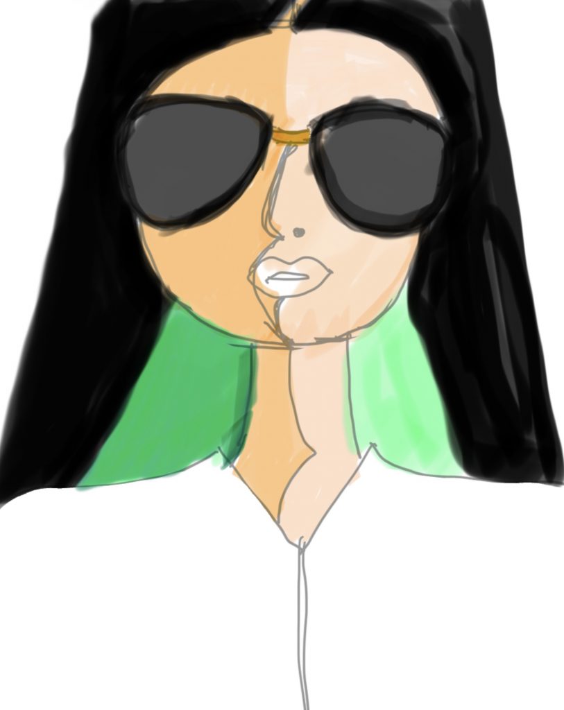
GREEN / YELLOW
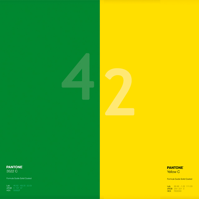
초록색 / 노란색
초록색은 색상환의 색 중 가장 유연한 색이라 할 수 있다. 노란색은 즐겁고 가슴 설레는 색으로 색채 심리학에서는 명확함을 나타내고 창조성을 묘사한다.
Green is the most flexible color of the ring. Yellow is a delightful and exciting color, and in color psychology, yellow represents clarity and describes creativity.
42
사이
너와 나의 42,
기능과 조건 42,
비움과 채움 42,
고정된 것과 이동 가능한 것 42,
그 관계를 디자인 하다.
Design the relationship between you and me, between function and form, between void and solid, between fixed and movable.
SPACE DESIGN
공간디자인
컨셉 디자인 / 인테리어디자인
/ 리모델링 / 시공
Concept Design / Interior Design / Remodeling / Construction
CCO.
(Chief Creative Officer)
– 홍익대학교 산업미술대학원 공간디자인 전공 석사
– (주)희훈 디앤지 / (주)중앙디자인
– 수상경력
- 2009 대구 EXCO 확장공사 인테리어 부문 당선
- 2003 제16회 한국 인테리어 대전 장려상
- 2003 제1회 경기 우수가구 공모전 가구 디자인 분야 입선
– Hongik University, Seoul, Korea M.A., Fine Art in Space Design, Graduate School of Industrial Art
– Heehoon D&G, Seoul / JAD, Seoul
– AWARDS
- 2009 The Competition for EXCO Expansion Construction in Daegu Won the Finalist
- 2003 The 16th Korea Interior design Competition, Gain Design Group, Seoul, Korea Won a Semifinalist
- 2003 The 1st Gyeonggi Furniture Design Contest, Gyeonggo-do, Korea Accepted for the Exhibition- Hongik University, Seoul, Korea M.A, Fine Art in Space Design, Graduate School of Industrial Art